Despite all the fear-mongering about the Sun's recent coronal mass ejection, scientific data has put this event to rest. Rather than look at sunspot photos, we need to look at the aggregate effect on Earth of all solar activity. This is what's really most important. This is measured by satellites which detect X-rays, magnetic fields, proton and electron flux.
CHART EXPLANATION
There are 5 key charts used by scientists for determining solar activity. These charts from NOAA are updated every 5 minutes. Images below were captured on July 15th, at 9:30AM EST. Yellow arrows and lines were added by author to aid the reader in understanding the data shown. For each chart the higher up on the chart the greater the level of activity for that chart.
SOLAR ACTIVITY
Yellow horizontal lines on chart below indicate the typical normal level of activity of the Sun. Each pixel on the chart represents 5 minutes. Horizontally, each chart is divided into 3 one day intervals.
The word "flux" used by NOAA is a scientific word which is simply used to indicate a quantity of a certain energy or electromagnetic wave is radiated. For example, light coming from a light bulb can also considered flux just as X-rays coming from a X-ray machine.
* Top left corner chart - X-ray flux is relatively unchanged before and after the coronal mass ejection event.
* Lower left corner chart - Magnetic field shows a relatively high frequency burst occurred, but is now settling down to the normal wave pattern.
* Center bottom chart - Kp index. This chart could simply be thought of as an indicator telling you how far south of the North Pole you may be able to see the northern lights. They will not appear as the usually blue-green curtains seen in Alaska in the lower 48 states. But these may be seen as faintly visible waves of pink light quickly moving across black star-filled space at night. The higher the bar graph, the greater the disturbance to the magnetic field. High energy particles from the Sun interact with the Earth's magnetic field to create these light patterns. According to NOAA, this chart is "calculated by NOAA to be the severity of disturbances to the magnetic field near Earth in space."
* Lower right corner chart - the amount of proton radiation flux from the Sun. This is measured in millions of electron volts. Chart colors can mislead people - red is not the highest voltage but is actually the lowest.
Green has the highest potential at 100 Million electron volts
Blue represents 50 million electron volts.
Red represents 10 million electron volts.
We can see the lowest strength proton flux (red) has sharply dropped back down toward its normal level (yellow line) just above the blue level. If the green 100 million electron volt level rises up like the red level did this can be of great concern to communications, satellites and electric companies. Fortunately this did not happen.
* Upper right corner chart - electron flux activity is dropping back down toward normal.
* Center top chart - all the charts combined.
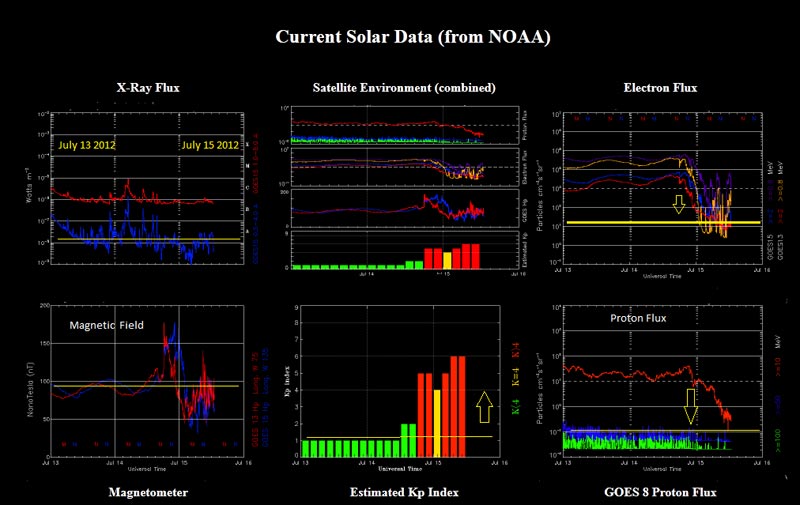
The only chart to show an increase after this mass ejection event is the Kp index, which is the expected effect on the Earth's magnetic field from the mass ejection. Did this effect background radiation on Earth? This author has measured background radiation using a calibrated Geiger counter on July 15th, 2012 in the northeast USA. It indicates radiation levels are currently at normal cosmic background levels. Earth's magnetic field has done the job once again.
Ted Twietmeyer
tedtw@frontiernet.net
|