Jeff,
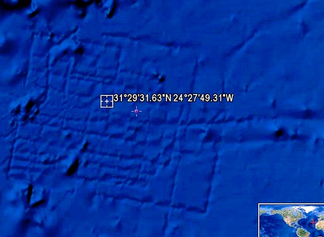
Thank you for asking my opinion about the symmetrical, rectangular seafloor
artifacts off the northwestern coast of Africa as seen via a popular
online map viewer. This is the second time I know of that this particular
piece of imagery has generated the exact same buzz online.
I have spent countless hours over the last 15 years acquiring, processing,
integrating (with other data sets) and presenting (in nautical chart
format) sidescan and multibeam data as makes up the interesting bits
of the imagery in question. The lines you see conform to the grid pattern
we most often use when characterizing a patch of seabed for whatever
the reason (fisheries habitat, platform anchorages, navigational charting,
geological investigations, fibre-optic cable routes, pipeline routes,
shallow (relative to seabed) hazards surveys, ... the list tends to
get tedious from here ...)
We lovingly refer to this sort of grid acquisition of data as "mowing
the lawn" ... it is a very apt analogy ... just as boring, but you have
to pay attention unless you miss a spot. The line spacing on these grid
surveys is usually established to provide overlap between one "swath"
and the next. My cursory measurements of the water depth and line spacing
in the area of question seem to correspond to a sonar survey grid.
The artifacts in question are, in my professional opinion, most certainly
artifacts of a prior, high-resolution survey being merged with the Satellite
Surface derived data seafloor imagery background.
The majority of the seabed imagery displayed via the online map viewer
in question is derived from satellite observations of gravity. Ocean
waters actually do bulge and dip slightly according to the sub-sea "topography"
immediately below. (Think of the wonderful time-lapse imagery of clouds
flowing over mountaintops as seen in the film Koyannisqatsi. The clouds
in that imagery cannot possibly reflect the detail of the mountain peak
it is flowing over, but you definitely know that a peak exists below
it.) Gravity data of this sort is very, very coarse. That is why the
higher-resolution data stands out so much against it.
I have personal experience directly relevant to this very fact. I was
lucky enough to have participated in an expedition last year to map
a very large group of seamounts north of the Galapagos Islands. When
we started acquiring our survey data, we found that the gravimetric
satellite imagery was incorrect ... instead of a grouping of 5 seamounts,
we found a solitary, large-plateaued feature not at all suggested by
the more coarse satellite data.
Our most accessible final planetary frontier, for me, is still a constant
source of amazement and awe ... as well as crushing boredom at times.
I keep a skeptical eye open for anomalies such as the one seen off the
northwest coast of Africa and do what I can to approach those anomalies
with a healthy skepticism. The imagery in question in the Canary Basin
has all the hallmarks of being a data artifact and not an ancient "artefact"
of a lost civilization. The most convincing evidence, of course, would
be finding the data set which was used to create this imagery. That
data set would be very difficult to forge ... at least, any forgeries
would likely be spotted by my much more talented brethren in the offshore
survey realm.
Safe journeys,
Chris P.
_____
Here is the NOAA debunk of the story
http://oceanservice.noaa.gov/facts/atlantis.html
|
![]()
